FAQ Page
UX/UI Challenge
This project was born out of the desire to show some UI skills applied to UX design.
I needed an interesting and challenging brief, so I rolled the dice with the Sharpen.design website.
My brief was: Design a FAQ page for a garden centre (I loved it!)
Layout
I wanted to tailor my design for a (fictional) garden centre that is both the “local one”, a business that gained the trust of its costumers over the years, but also its own evolution as it successfully jumped into the e-commerce.
The keywords I decided would shine through the FAQ Pages for this business via my UX/UI project were:
Competence (expert, qualified, professional) and Trust
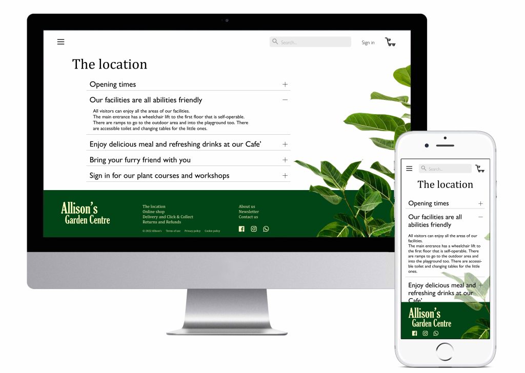
I decided to start with the design of the desktop version. I wanted to take advantage of the space available to carefully position the information I wanted to deliver with some natural elements (the plant on the right), creating a peaceful balance of solid and empty volumes.
Visual elements
For the graphic, I was inspired by a number of plant-blogs, that currently represent and endless source of information about plant care for the plant lovers. Invincible House Plants is just one of them!
The green colour plays an important role into the delivery of the above keywords. I didn’t want it to be joyful (like mint or any pastel green) but I needed to be both fresh and genuine, a “serious” green, if that makes sense!
Footer
I did a Benchmarking Research on 3 e-commerce businesses selling plants, and I realized that the footer plays an important role into this project.

But I wanted to keep it tidy so I decided to put only the most important links on it.
It is home for the business logo, as well as for the links to all the information related to the shop online. I decided to put “Delivery, Returns and Refunds” always visible on the screen for 2 reasons: deliver a better experience and address any possible deal breaker.
The footer also contains an easy access to the business’ social media channels.
FAQ section
FAQ stands for Frequently Asked Questions, but I didn’t want to put questions about the shopping online, as these should already be addressed into the relevant pages (see Shopping online, Delivery, Returns and Refunds in the footer).
This page instead, has been designed for the customers that visit the physical garden centre.
I decided not to put a random text or, even worse, Lorem ipsum, as I wanted this screen to give the real “flavour” of the questions this garden centre receive every day.
In the research I did, FAQ pages of competitors often address very specific questions, but for this project I needed to deliver information both on the e-shopping and on the physical shop.
So I put down a list of topics I wanted to highlight for “Allison’s Garden Centre”, questions that customers would like to know before visiting the facilities, and subjects that the garden centre would like their customers to know (the information on the Cafe’ and the workshops).
I started to writing questions, then I realized that questions are difficult to read while statements are easier to scan. Also statements deliver the same information in a more confident way.
So I edited the “FAQ page” title into “The location” page.
I created a visual hierarchy between title page and headers, as well as headers and text (the answers) into the accordion menu. In this way the list is shorter and the info needed will be more easy to find.
I made sure that the paragraphs of the “answers” would not be more than 60 characters, for best readability.
Header
As all the relevant information are already fixed on the screen in the footer, the header of this website contains just a few essential elements: the search box, the “Sign in” link and the Basket. Everything else is hidden inside the menu/navigation accessible by the hamburger icon.
This choice contributes to the balance of solid and empty volumes.
Mobile version
Smaller screens are challenging but I was able to adapt the desktop layout easily.
For this version I decided to align the headers and text for better readability.
For the same reason the “decorative” plant element has been put under a white transparent layer, to add contrast with the text.
The footer is now home only for the business logo and the social media icons.
Wireframe
To complete the project, I’d like to add a few notes that explain how some interface elements work to help the user to accomplish the task of “finding more information”.
These would be handover to the development team to help them to build the FAQ page.

I worked on this project in March 2022