Hotel Booking App
This is my journey
This is my first journey into UX and I am excited to show you the process I learned and the results I achieved during my UX Design course, that I took between September 2021 and January 2022.
My final project/goal was to design a new Hotel Booking App, with a clickable prototype and wireframes full of details to handover to developers. This app should solve problems other apps don’t, offering a nice and smooth experience to the real users.
I worked alone on all the projects that follow, although for some of them would have been beneficial being in a team.
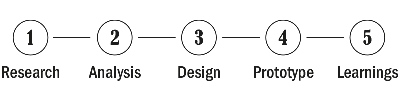
These are the main phases of the process and in the next sections I am going to take you through this journey and explain what was the purpose of each step and how helped me to move forward.
1. Research
Competitive Benchmarking
I always liked to conduct research on competitors before starting to design anything. This technique allowed me to identify what competitors in the same field are doing right or wrong and how they solve the problems I am trying to solve.
I reviewed the apps of 3 of the biggest Hotel Chains (Hilton, Accor and Best Western) and 1 aggregator website (Trivago).
I put together a presentation on the main user’s flow, with screenshots and notes to explain my findings regarding competitors’ apps strengths and weaknesses, seen as opportunities to do better.


Online Survey
I created an online survey with Survey Monkey and I shared it via email and WhatsApp with 30 friends, making sure that the purpose of the survey and the reason why I needed their help was clear.
With a good mix of structured ad unstructured questions I gathered very useful data regarding users goals and behaviours when using a hotel booking website/app. It was also great to read their hypothetical solutions to the problems they incurred in.

Usability Tests and Note Taking
Usability testing is the most powerful tool a UX researcher has. It allows to gain rich insights directly from the user and I really enjoyed using this research techinque.
In a working environment these interviews are compelling, challenging assumptions that are usually made without any real research on real users.
For this task I first set up a script and I conducted depth interviews and recorded 2 usability tests using Loom. I did these interviews in person.
The first part of the interview, that lasted about 20 min, was about learning users’ goals, behaviours and the context of use while booking hotels through apps.
In the second part, that lasted about 30 min, I gave them a set of tasks to complete and I watched them interact with the Hilton and Booking.com apps. This activity really helped me to understand what are the users’ mental models, why they were induced in a certain behaviour, what they enjoyed along the way and what were the pain points in the process instead. For example it has been fun and eloquent when my friend closed the app without booking the room after he realised the best rates were available for the members only!
Finally I reviewed my footages and I took notes for each interview plus two interviews included in my lessons. I included the most important quotes too.
These have proved to be really useful in the next steps of my process.

“These pictures really put me in holiday mode“

“I selected the filter “free parking” but sometimes filters don’t work, so I need to make sure.“

“I don’t think I am going to have any profit tapping on these contents“
2. Analysis
Affinity Diagram
At this point I had a lot of qualitative data from my research projects but it was messy and badly organized. I needed to put structure and find relationships between common topics, and the affinity diagram revealed to be the best tool for this task. Ideally this would be a team activity, but I did it alone using Miro board. During the process I had a lot of back and forth with my research data and just then I really understood the power of good note taking.

Step 1. I wrote a number of post-it and stuck on the virtual wall. Each post-it contained a single note describing contextual user’s goals, behaviours, mental models but also pain points and positive interactions with the Hotel booking apps.

Step 2. I grouped all the notes in clusters that made sense to me. I chose a name for each cluster and I created sub-groups of notes that shared a common topic. I added some arrows to create a link between notes put under different clusters.
I finally got categories of data to investigate further before attempting the designing process.
Costumer Journey Map

Customer Journey Map is another way to organize data and I really benefited of the Affinity Diagram findings.
CJM is structured and self explicatory. It contains all the ingredients for building a good software and also a great document to share with the stakeholders.
What I did: I made a graphic layout as a grid. In horizontal all the steps of the user’s flow and in vertical the touch points of the user’s experience.
In each quadrant I went more specific, including my notes on the research data conducted, as well as some user’s quotes.
Finally I made some emoticons to sum up the user’s feelings during the journey.
The map highlighted that I needed to improve some areas of the experience. 1st list of Hotels and Rates are the most critical, but also Map and Filters and Room page required attention. There were a lot of frictions between the users’ mental models and the software, and these represented my opportunities to design better solutions, starting from the next phase of the project.
3. Design
Flow Diagram
At this stage, with the evidence of my research data, I was finally ready to define the high level booking flow – the “happy path” – for my mobile app, addressing all the issues highlighted in my Customer Journey Map. In other words, this represented the first step of building the solution.
I first started sketching on a notebook the Actions and the Screens that could reflect my CJM and what I have learned during the Research process. I used squares to represent the screens and circles to represent the actions required by the user.
I copied these actions and screens on a simple Figjam document.
I really wanted this flow to be as short and smooth as possible and it took me a few attempts to make it just right, e.g. in the circuit of browsing into the Hotel List and the circuit of checking the Hotel Page details.

Interaction Design
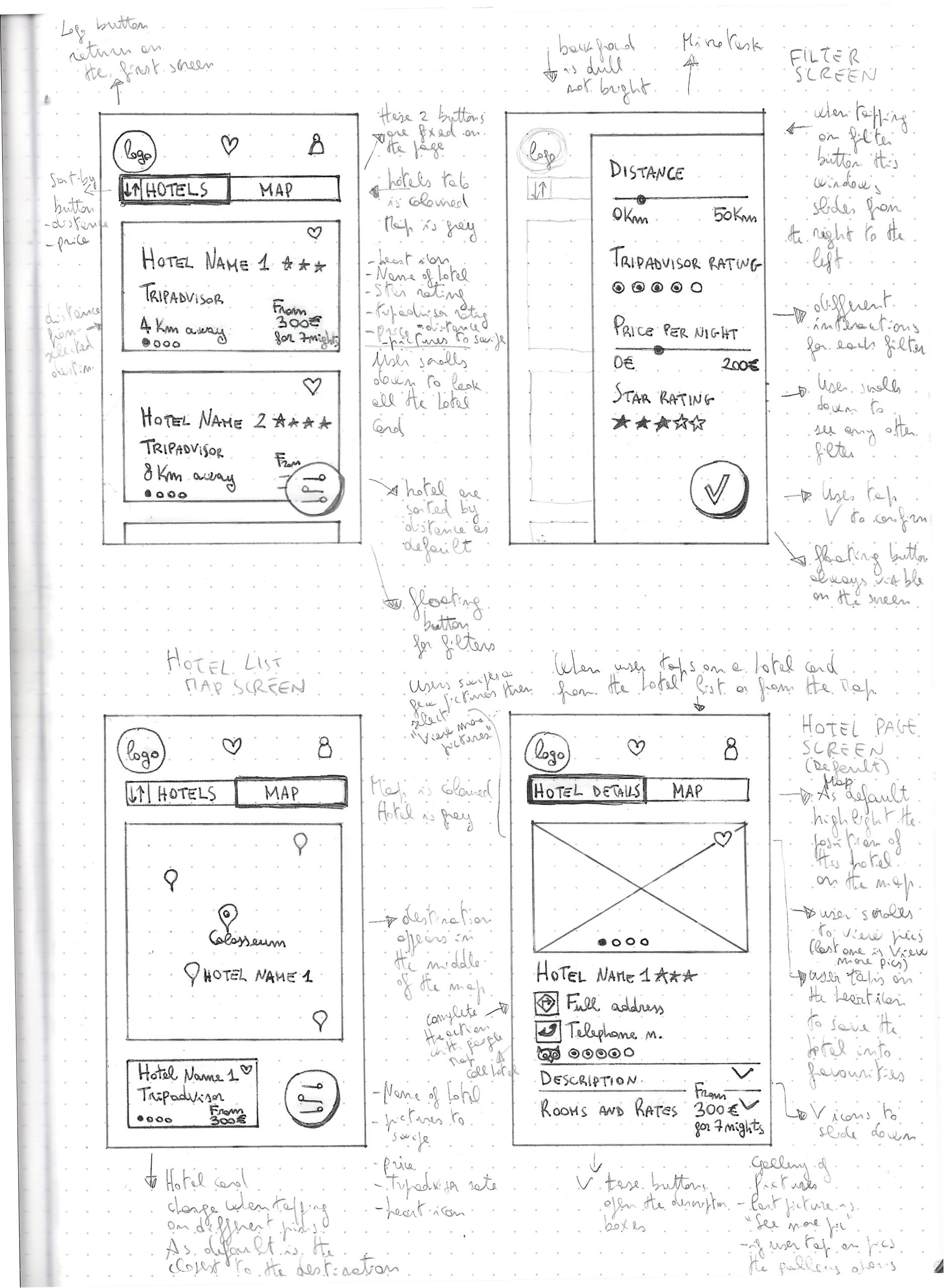
Sketching is a vital step before prototyping or digital wireframing and is also time saving and cost effective. It allowed me to quickly put ideas on paper, but also to do improvements and refinements along the way.
_I started designing the screens listed on my Flow Diagram, using a pencil on a dotted notebook.
_I put notes on the side of each screen to clarify some points and to describe how some interactions work.
_At the end I marked with a pen the final versions of the screens. I scanned all of them just to build a presentation that could be readable by all.

4. Validate
Medium Fidelity Prototype
After defined the solution with my flow diagrams and sketching screens on paper, I started creating a Medium Fidelity Prototype with Figma.
It has been a fun activity as I finally had the opportunity to build my prototype. I kept all the “good things” I have learned from my research data and I designed new solutions where needed.
I put a lot of attention into the Hotel cards and Hotels pages, including the Rates available, as I knew what users wanted to find in order to take decisions.
I also took care of many details, e.g. having the destination in the middle of the map, and the map easily accessible, was a paramount again for decision making.
A digital prototype helped me to validate the user’s flow, basic interactions and feedbacks, the effectiveness of the copy, etc.
In fact, after having a few feedbacks, I needed to make some adjustment to what was my first prototype build just as the sketches were.
E.g. I made the mistake to put the off canvas navigation under a “logo” icon (usually used to return to the homepage) instead of the hamburger icon, and that represented a user friction for what is an established convention.
As result, the flow is now smoother and the task can be completed in less time.


Wireframe
This was the last project of the course and also the last to be made when designing a software, although in the real world the design process is never finished and keeps improving time after time.
The purpose of this document, together with the Flow Diagram and the Prototype, is to give to the developers as much information they need to build the product accurately without second guessing.
For this reason I tried to put as much detail as I could into the annotated notes on controls, rules, feedback, navigations, links between screens, error messages. Going again in such details on the project, allowed me to review some inconsistency on my prototype that needed to be addressed.
As I said, there is always room for improvements and this is a never ending opportunity to make a design a good one.

5. Learnings
I really enjoyed this journey, from the start to the end. Maybe, if I returned to the research and analysis phases, I would have put more attention on the Rates pages of the competitors, as I realised later on that there is a lot of confusion on nomenclature and the way these data are organised.
But following the process I was taught was easy and sensible. Get rid of assumptions and never skip the research phase was the most valuable lesson.
I am certainly looking forward to improve my skills but I am confident that the diploma in UX design obtained at UX Design Institute will be a ace in the hole in my future as designer.
I worked on this project between September 2021 and February 2022