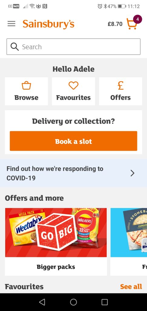
Sainsbury’s Favourites page
Fictional project
The Problem
I am a Sainsbury’s client. I use their app to shop online several times in a week. I mainly use their Favourites page to browse the items I want to put in the trolley and then I complete the shopping and book a delivery 2 to 3 times per month.
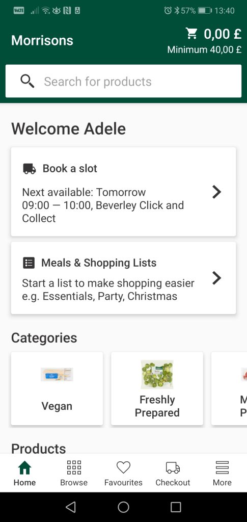
The Favourites page looks like this and I usually scroll down a list of 182 products to find out what I need.

In fact, if I do the “shopping” in one session, it takes me at least 10 minutes to complete the shopping, and to find the exact bread I bought 2 weeks ago and I loved.
How it works
Essentially, each time I buy an item, both in shop or online, the item automatically get an “heart” and goes into the favourites folder, usually at the bottom of the list.
This means that, even though you are buying an item for the first time and it is not sure yet if you are going to love it or not, it will go into the favourites.
Also if user browses for oranges and he buys once the Sainsbury’s Oranges Large x4, the second time the Sainsbury’s Oranges x5 and the third time the Sainsbury’s Oranges he is going to have 3 more items into the Favourites folder.
These are the main reasons why my Favourites list is so long, even though I “de-heart” the items from time to time.
I could use the options Filter and Sort by, but these features never really helped me to save time and save me the stress (more details into the Competitive Benchmark Research).

The Methodology
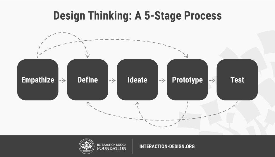
To improve the experience of buying browsing from the Sainsbury’s Favourites page, I am going to follow the Design Thinking process. I am confident that it will help me to discover and define the problem first and then I will try to detail the key points of improvement and hopefully propose a solution.
This is a work-in-progress page, and I will update it at the completion of each stage 🙂
1. Empathize
From now on I will put aside my assumptions and I will try to understand the user and empathize with him/her. To do this I need to focus on the user research and I am going to use a number of techniques to gain as much data as possible.
Competitive Benchmark
The objectives of my competitive benchmarking research are going to be the following:
• Define what are the main competitors of Saintsbury’s
• See if they have a Favourites feature on their shopping online app and notice how it works
• Produce a presentation with screenshots and plenty of notes about positive and negative interactions using the Favourites pages
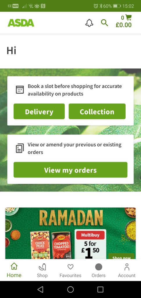
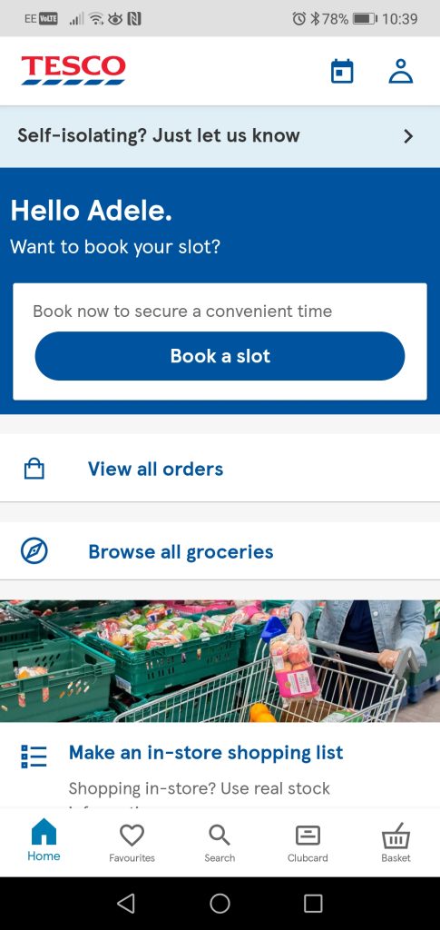
As confirmed by this SWOT analysis, the main competitors of Sainsbury’s are Asda, Tesco and Morrisons.
Here is the link to view the full Competitive Benchmark research on the Favourites page of these brands.
Conclusions are: Asda offers the best experience browsing items from the Favourites page. Sainsbury’s need to improve the Filter and Sort by tools to deliver a smoother flow. Also Sainsbury’s need to modify Categories names to match the users’ mental models.
All the insight from this research will be analysed later on with the data gathered from other research tools.
Usability test
At this point the most sensible think to do is to interview a few users to understand their point of view, their goals and struggles when using the Favourites page while shopping online.
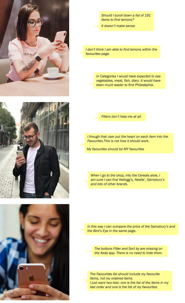
I decided to conduct 3 Usability tests on Sainsbury’s and Asda app. I prepared a script with an explanation of the reasons I asked for help and what will be the data used for, as well as all the questions I wanted to ask in relation to some tasks to perform.
I had a lot of fun during these interviews. The users gave me meaningful insights on their goals and behaviour patterns without knowing it and I absorbed new points of view and mental models on various aspects of their journey.
I learned that e.g. User F’s goals are different from mine and, as UX designer, this was a reminder that I am NOT a representative user.
However, all the users shared the same pain points while using the Favourite pages, and this made me confident that I spot a real problem and I have now an opportunity to do a good job with a solution.
2. Define
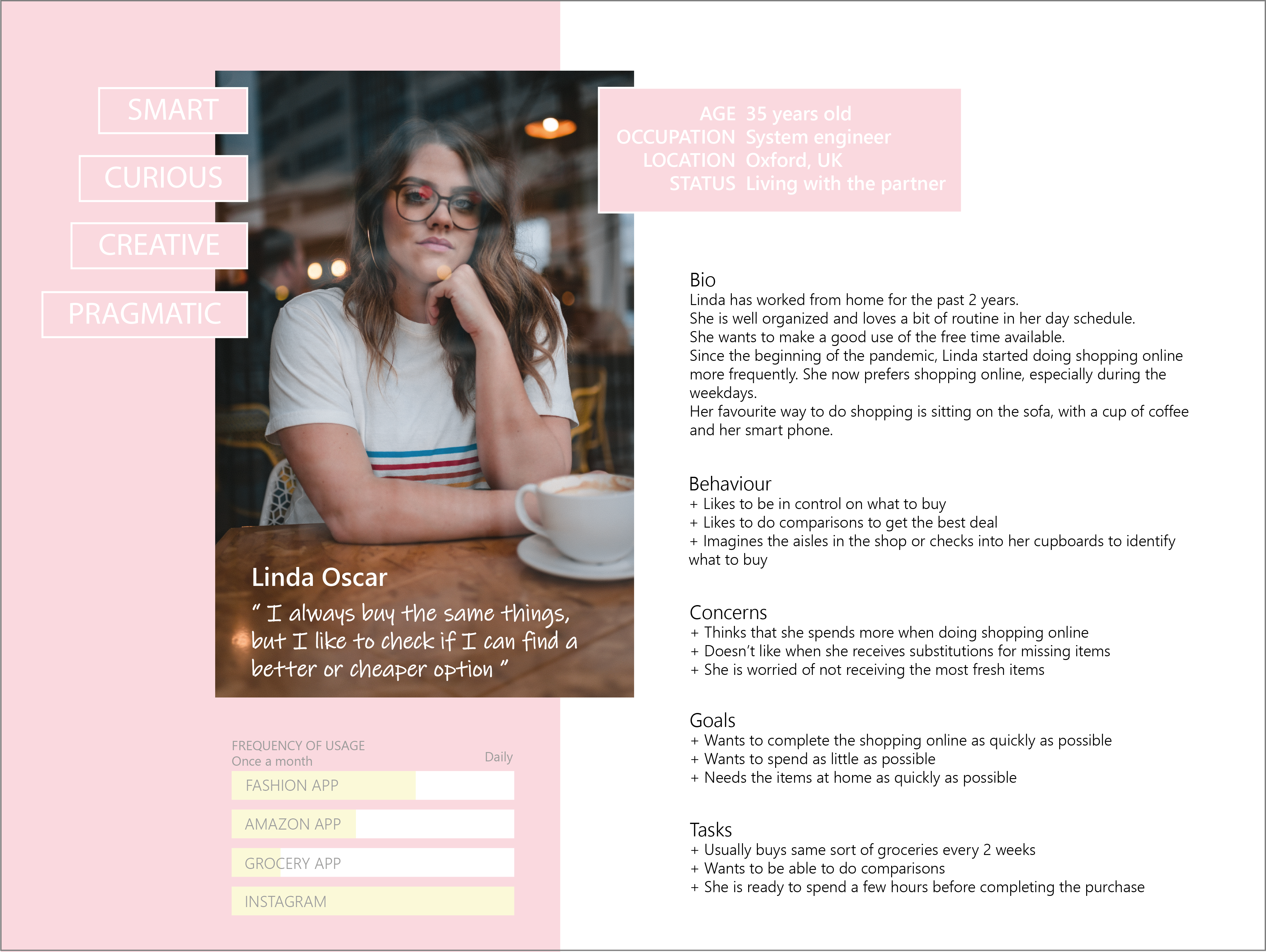
Finally I could start to put order into the data I gained till now, and I was able to define “my user” and some of the main topics to focus on.
Persona
I run just 3 Usability tests but I noticed that my friends have lots in common, same goals, same struggles, same way of thinking. Creating a Persona would help me to highlights a full set of characteristics, desires and behaviours that are going to be useful in the next phases of the project.
Affinity diagram
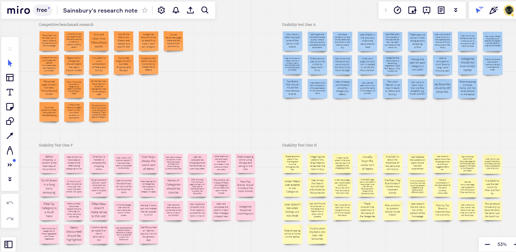
Using Miro, I wrote a concise and contextual note on each of the important topics that the 3 Usability tests and my initial research brought out.
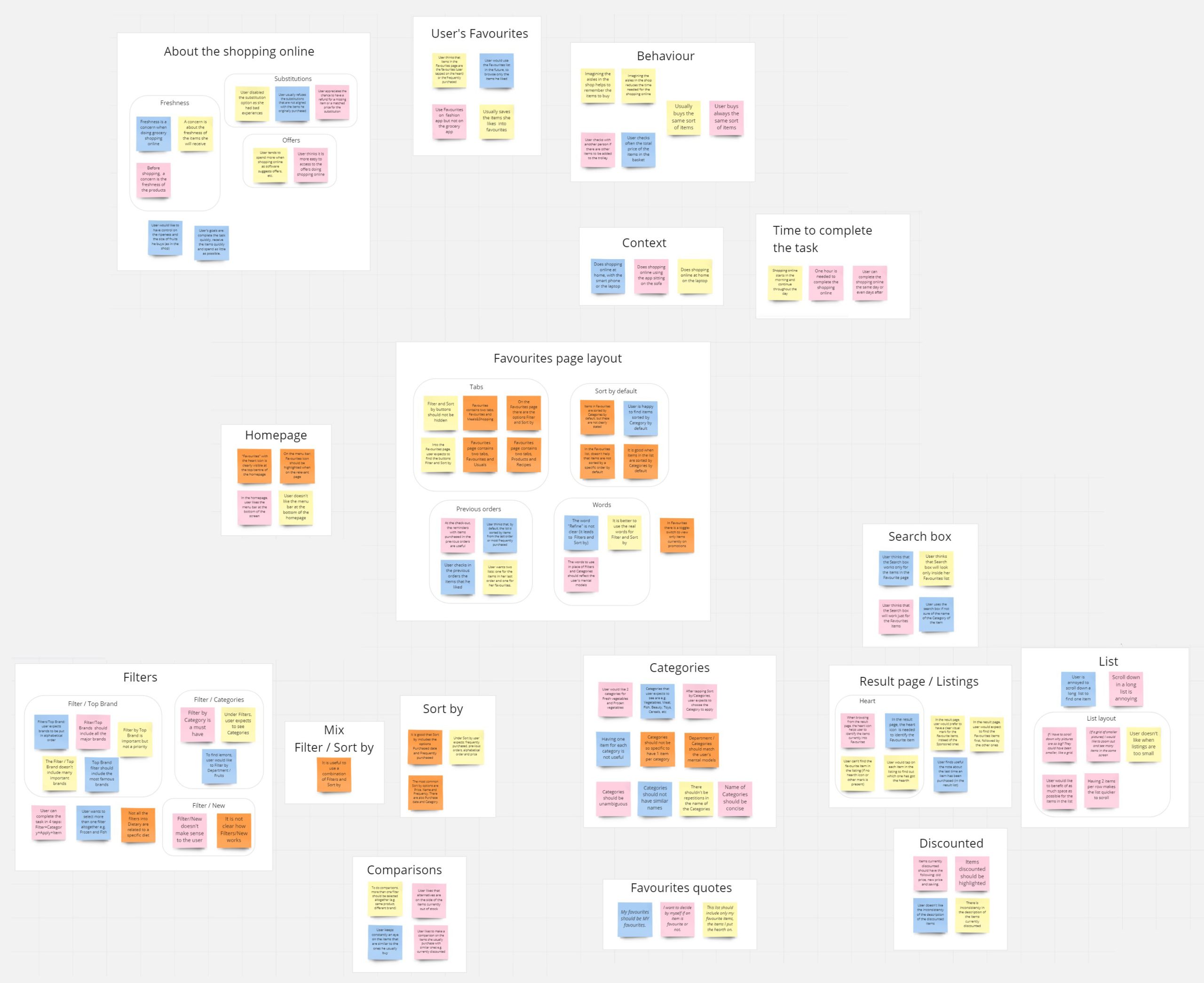
If you want, you can open the picture and hopefully be able to read the notes.
Later, I grouped together the notes that shared a common topic and I put a title on each cluster. Sometimes I added sub-categories within the main categories, as I was able to organise information one step further.
Empathy Map
At this point of the process I needed to create a document that could sum up my findings and define my goals.
A Customer Journey Map wouldn’t be applicable, as there isn’t a linear flow here but the navigation modality is hub and spoke. The single central screen – the Favourites page – enables the user to explore different sections – Filters, Sort by, Categories, Search box, etc. – of the app.
An Empathy map instead, would help me whether to categorize and to clearly show attitudes and behaviours of my user Linda.

From this map I already see some topics that will be more easy to explore while designing my solutions. But there are also topics that I am not sure if I have enough material to work on, as maybe this would require a separate research, e.g. Substitutions and Offers.
I will do my best with what I have.
3. Design
Flow Diagram
With this piece of work I have been able to define the high-level flows for the Favourites page.
It couldn’t be linear as user will do hub and spoke on the different elements to personalize the searching of the items.
With the all the findings of the Research phase and the Empathy Map in mind, I started designing this solution that currently features 4 main elements: Search into the Favourites, Filters, Sort by and Previous orders.

I used squares to represent the screens and circles to represent the actions of the user, just one action per circle.
Naturally, user can and will use the 4 elements all together if needed, but with this representation I needed to make clear the actions required for each route.
4. Prototype
At this stage of the process I had really clear what my design solution would have been. I almost didn’t have to think about it: all the solutions have already been given to me by the activities that I have done for this project.
I started sketching the key screens of the journey and then I quickly edited them with Photoshop so I can share them here, with all the explanations, like a wireframe would also do.
Homepage

I didn’t need to modify the Homepage originally. In fact in the Flow Diagram I put the Previous orders button into the Favourite page, as one user suggested me. However I realised that these would have caused confusion. Also it is good to remember that not all the items previously purchased are “favourites” by the user, so I did this way:
_ I put a Previous Orders link into the Homepage (in place of Offers)
_ I gave to the user another way to check into favourites from the previous orders (see Sort by paragraph) while into the Favourites page
Favourites page

I did a few modification here:
_ Search box: all the users I interviewed thought that the search box would look only into the Favourites page. This was one of the most evident mis-matched mental model (see Empathy Map above).
In this solution I put the Search box with the hint text “Search all Favourites”, as the software would now look only into the list of the user’s favourite items.
_ I removed the number of items currently into Favourites as I don’t think this extra info was an added value.
_ Sorting: Items in the list are sorted by Department by default, e.g. Diary, but user can change this option.
_ Spacing: Users complained that the list was to long and that scrolling down through it takes a lot of time. I worked on the single item listing, decreasing its height so that user could see more items with less scrolling!
(make a comparison with the “before” version at the top of this page).
Filters
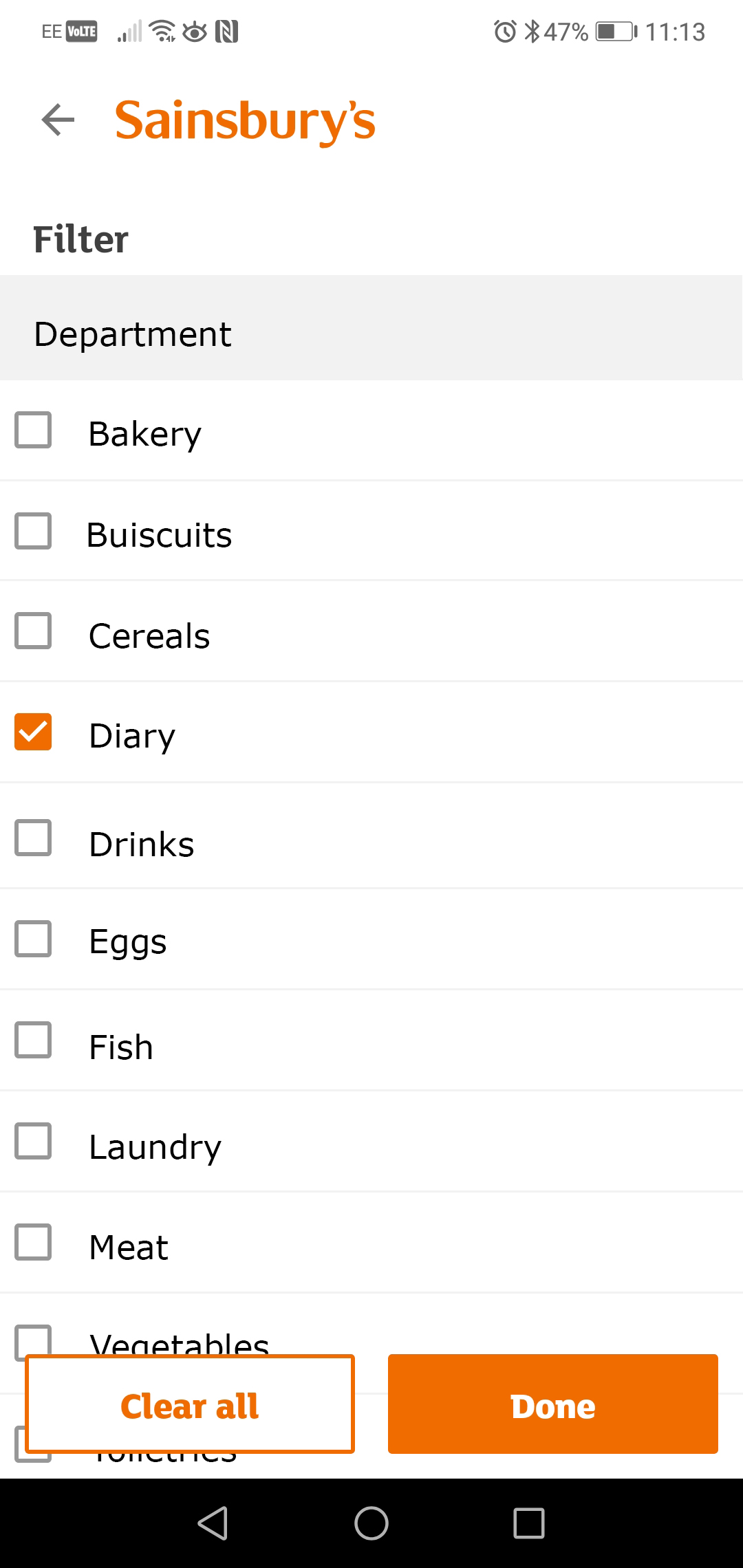
_ Department is the most used filter and it is the one I put first. In particular Departments are put in alphabetical order.
It is important to chose the right name for each department, in a way that make sense to the user. In the Affinity Diagram above we already saw that Department/Categories should: be concise, be unambiguous, not too specific to contain just a few items, avoid repetition, etc.
Can these be the name of the isles in the shop? Can these be the most frequently words searched by users? The answers should be backed by loads of research.
_ Other filters could be (as highlighted by my research):
1. Dietary: Vegetarian, Vegan, Gluten free, etc.
2. Storage: Chilled, Frozen, Cupboard, etc.
3. Offers: as some users wanted to have full visibility on item loved and currently discounted
Checkboxes make sure that user is able to select more than one filter all together. This is because e.g. the item peas can be found in Department/Vegetable, Dietary/Vegetarian and in Storage both as Frozen and as Cupboard.
_ I edited the Done/Clear buttons as floating buttons, to give more visibility to the items in the list on the back.
Sort by

As seen before, the Favourites list if sorted by Department by default, but users said they would also have other options too, like Sort by favourites items contained in the Previous orders and alphabetical order too (see a comparison with the “before” version at the top of this page).
Other improvements to make
_ Comparisons: Users said that if a favourite item is out of stock, they would like to see similar items right below. In the same way they said that, when looking into the list of results, they would like to see similar items after their favourite ones to do comparisons.
_ Consistency, e.g. on the way to communicate items on discount, should be always kept.
“My Favourites should be MY Favourites”
This sentence recap the shock the users had when they realised how the Favourites list is populated (see Usability tests scripts above).
I think that it is important that the software puts in the Favourites list only the items that the user loves, only the ones that had been awarded with an “hearth”.
5. Learnings
Since I was not able to create a high fidelity prototype that could allow rich interactions, this project is missing of the test/validate phase with real users.
But considering the small data I gained during the research phase, I truly believe that all these changes will make a real difference in the user’s journey as the user will be in control of the whole shopping experience. If I had access to more qualitative data probably my design solution would have been different, but I feel proud of what I achieved based on what I have got.
While working on this project I tested what I learned during the UX course but I also learned and practiced new techniques, like Persona and Empathy Map, that I felt more appropriate given the nature of the project.
If I would start again from the beginning on this project, or any other project that is basically the improvement of an existing product, I would certainly need more quantitative and qualitative research data and be on the frontline of a number of usability tests as this has been the key to really understand the problem to then shape the solution.
I would love to have a conversation with the designers from Sainsbury’s to understand and learn more.
Thank you for reading all an please drop a line if you want to have a chat about this project 🙂
I worked on this project between February and May 2022